01
Framer
Direction-aware hover
Summary
Combine Framer Motion + CSS for hover effects.
Use
pseudo-elements&clip-pathto extend hoverable region.Customize with
propertyControls.
01 / 05
Background
While direction-aware hover effects are not a new concept, I've taken the initiative to reimagine them using Framer Motion and CSS, transforming them into a Framer component that boasts:
✅ 100% responsiveness.
✅ Complete customization.
✅ Seamless integration with Framer's native features.
This enables the component to be utilized creatively across a wide range of use cases. In fact, upon examining the demo project, you'll discover that it's entirely constructed from a collection of direction-aware components.
02 / 05
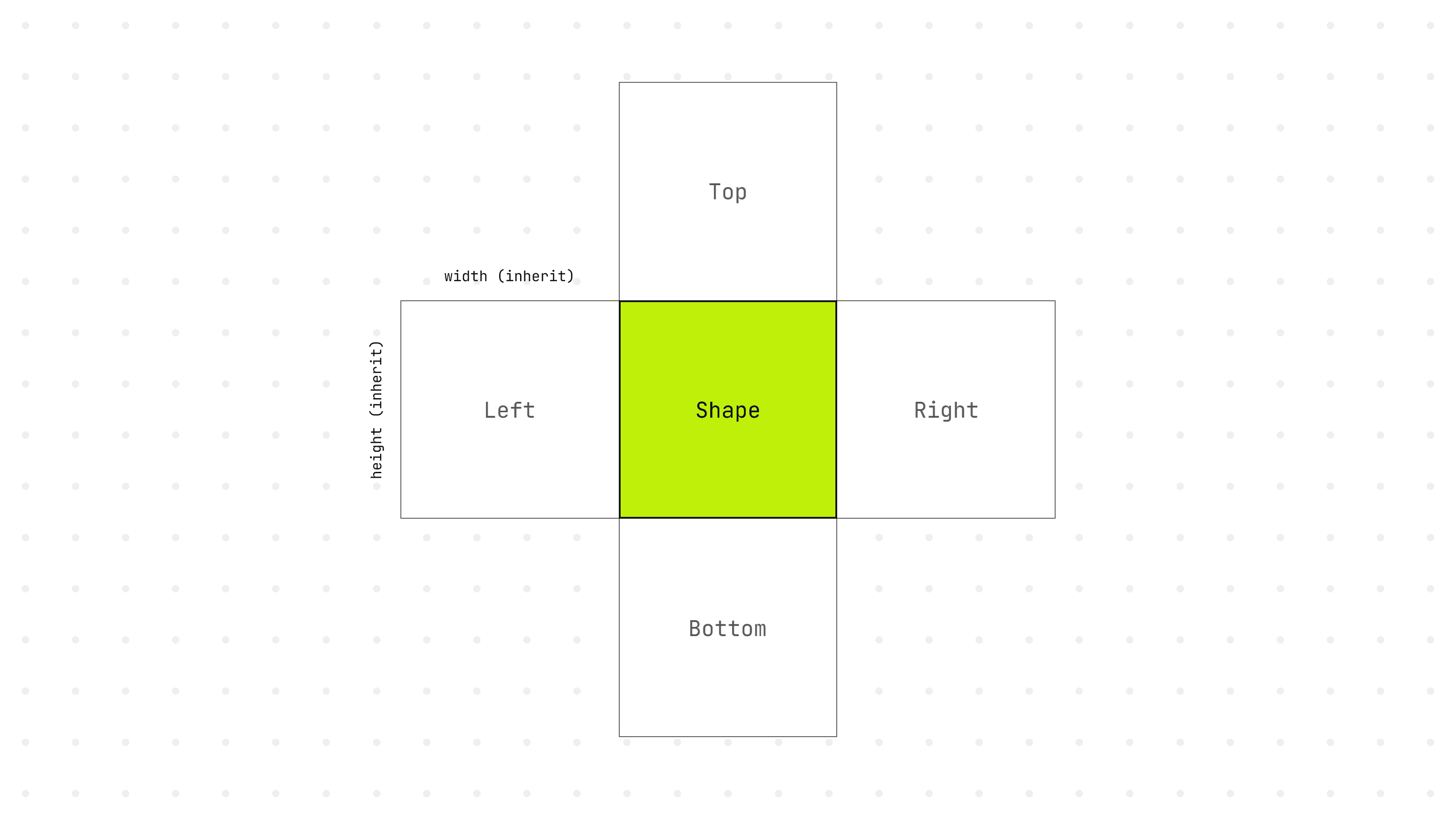
Building the structure
To achieve the desired effect, we must create a shape with 4 sides (top, bottom, left, right). Each side will inherit the width and height from our main shape and will slide in upon hovering over the shape.
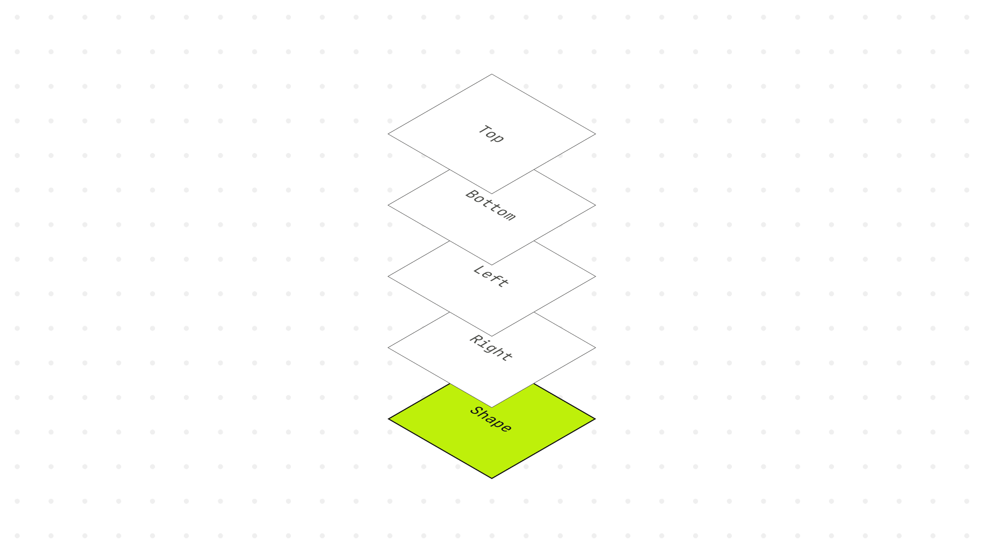
Next, we'll translate the sides out of view. By setting the parent element to position: relative and the child elements to width/height: inherit, we'll utilize a value of 100% to reposition the sides.
The following is the JSX structure for the right-side hover.
03 / 05
Extend the hoverable region
In order to identify the hover direction, we need a method for capturing the hover event. Since we've relocated the sides outside of the shape, triggering the hover event becomes impossible; thus, we must introduce a pseudo-element to expand the hoverable region.
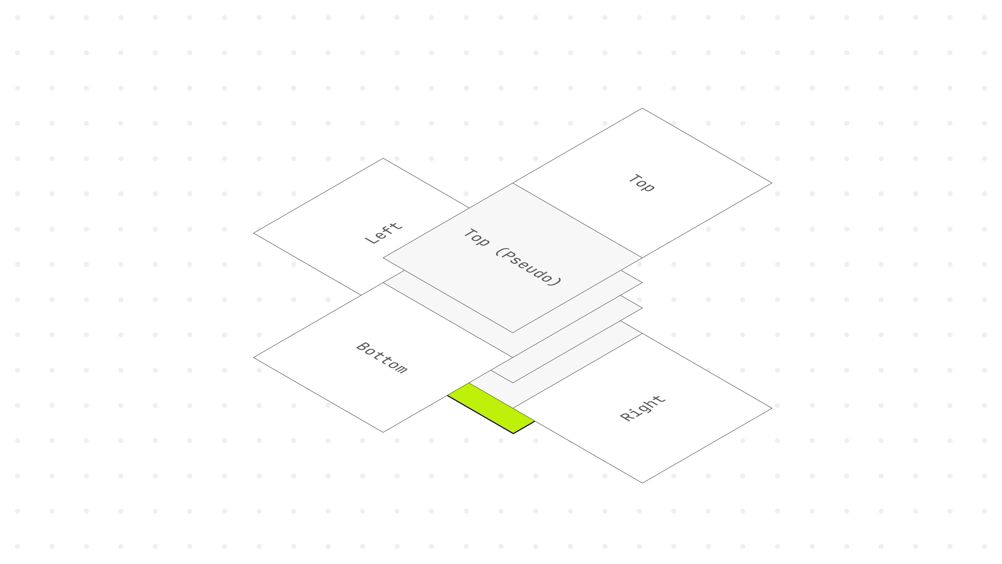
It's also crucial to add z-index: 1 on hover to prevent interference from other sides.
Clipping the pseudo-element
To guarantee that the hover effect can be activated when moving the cursor over a shape of any size, we can employ CSS clip-path to generate a triangular shape from each side that envelops the entire shape. We'll render it transparent to prevent it from being revealed.
04 / 05
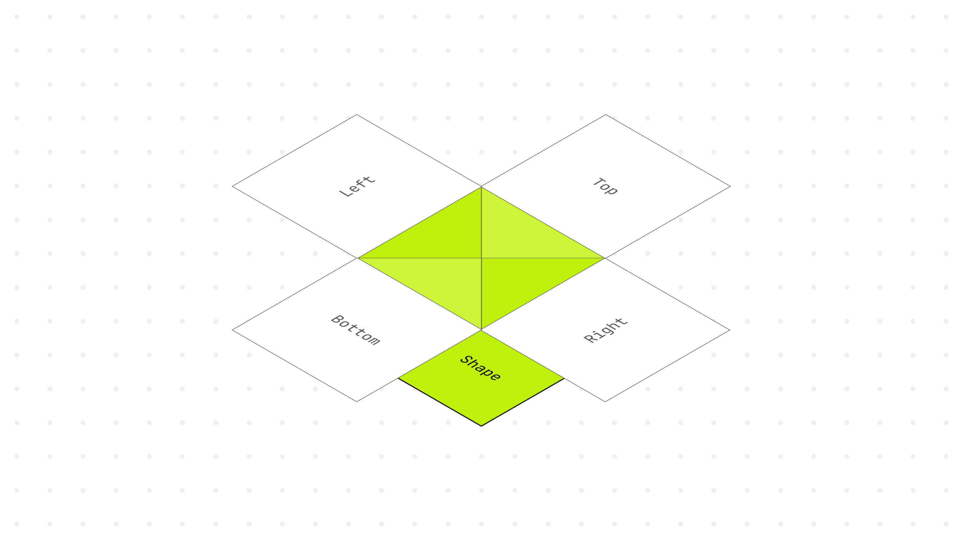
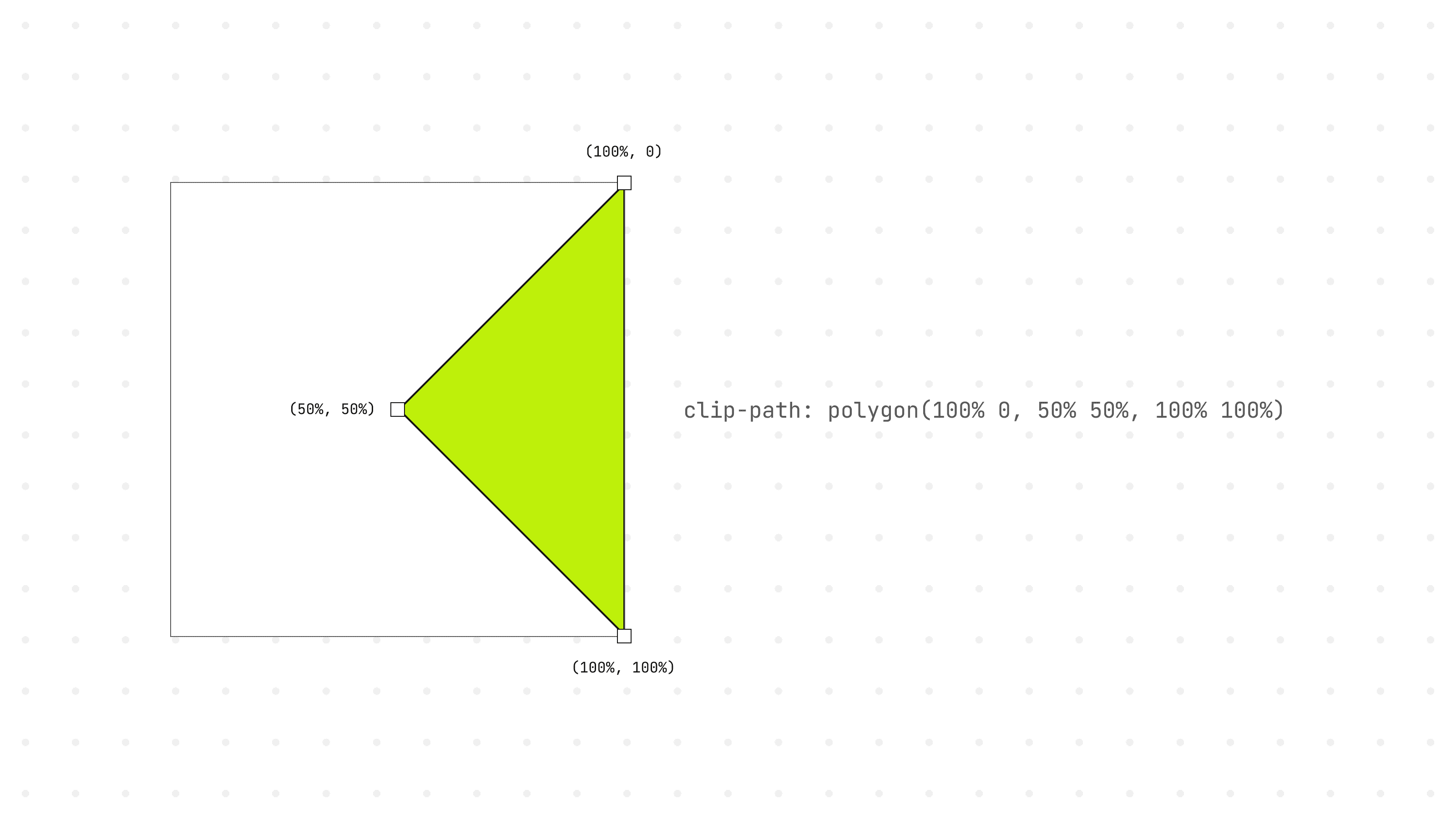
Ensuring responsiveness
The following example demonstrates how to calculate the right-hand side pseudo-element's shape using clip-path: polygon(). We’ll be using percentage value for the 3 anchor points. With a % value, no matter how the user resizes the shape, the pseudo-elements from all 4 sides will consistently maintain the correct size.
05 / 05
Final thoughts
In my Framer component, I've incorporated an array of propertyControls to enable the passing of properties to the component via the Framer interface.
Check out the final demo here: direction-aware.framer.website
If you find this resource useful, please let me know. And if you ever incorporate the component into your work, I'd be thrilled to see it 😄