02
Framer
Radial background
Summary
Create animated CSS gradient effects powered by Framer Motion.
Animate gradients by altering
background-sizeandbackground-position.Utilize keyframes to choreograph the animation.
01 / 05
Background
A while back, I explored the concept of animating the CSS repeating-radial-gradient property, and the results were quite impressive, considering that it only involved CSS within a single <div>. This inspired me to develop a Framer component to recreate the same effect.
This effect combines:
Multiple
repeating-radial-gradientlayers.Adjusting color stops.
Experimenting with
background-position.Incorporating
background-size.Animations using Framer Motion.
The outcome can be a series of fascinating visual effects!
Directly manipulating the code to achieve the desired effect can be challenging, as it's often difficult to anticipate the outcome with numerous options affecting each other. Therefore, I transformed it into a Framer component with a wide range of customizable properties, making it simpler to obtain the desired results.
This component is designed to accommodate various use cases:
✅ 100% responsiveness.
✅ Static pattern, animating on start or on hover.
✅ Complete customization (Color stops, transition, keyframes).
✅ Seamless integration with Framer's native features.
02 / 05
Radial gradient composition
The CSS repeating-radial-gradient() function enables creating a radial gradient pattern that repeats endlessly. I won't delve into its mechanics, as numerous developer resources already explain how it works: repeating-radial-gradient()
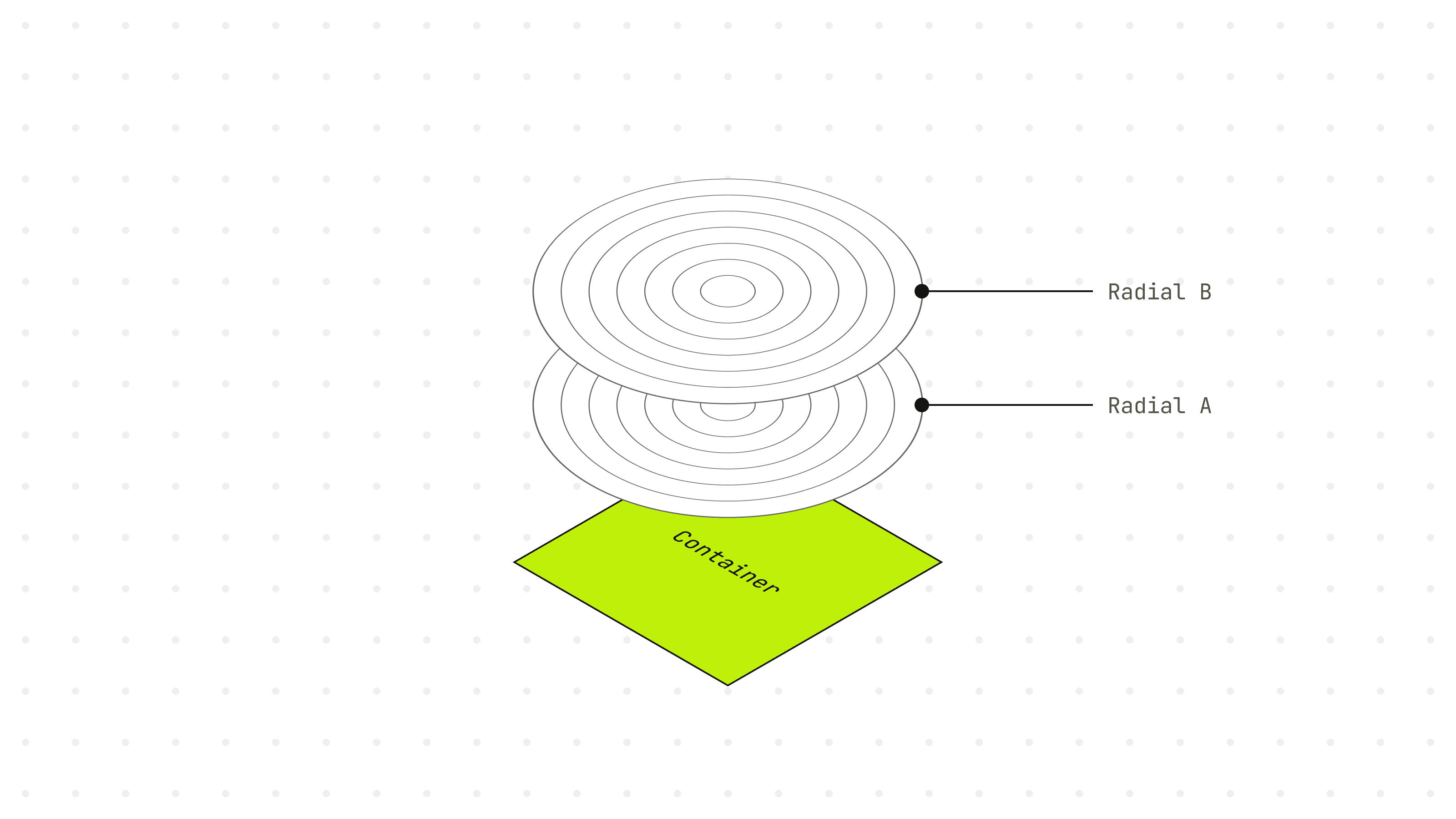
However, I will provide an overview of how this component is constructed.
For this Framer component, I opted for two repeating radial gradients, as more layers would make the component difficult to configure.
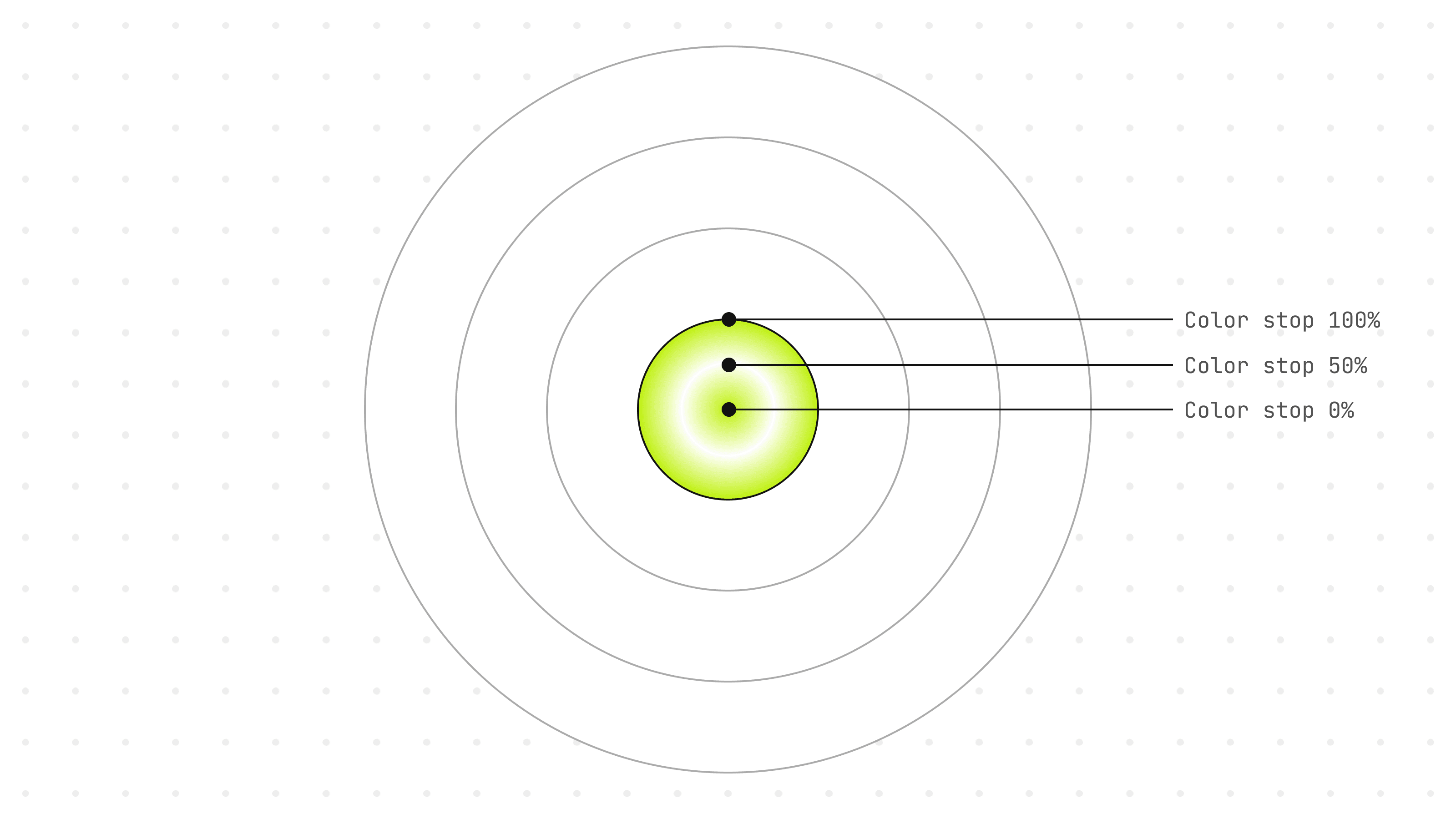
Regarding color stops, I chose three distinct stops where users can define their placements.
React props are passed through propertyControls.
03 / 05
Size and position manipulation
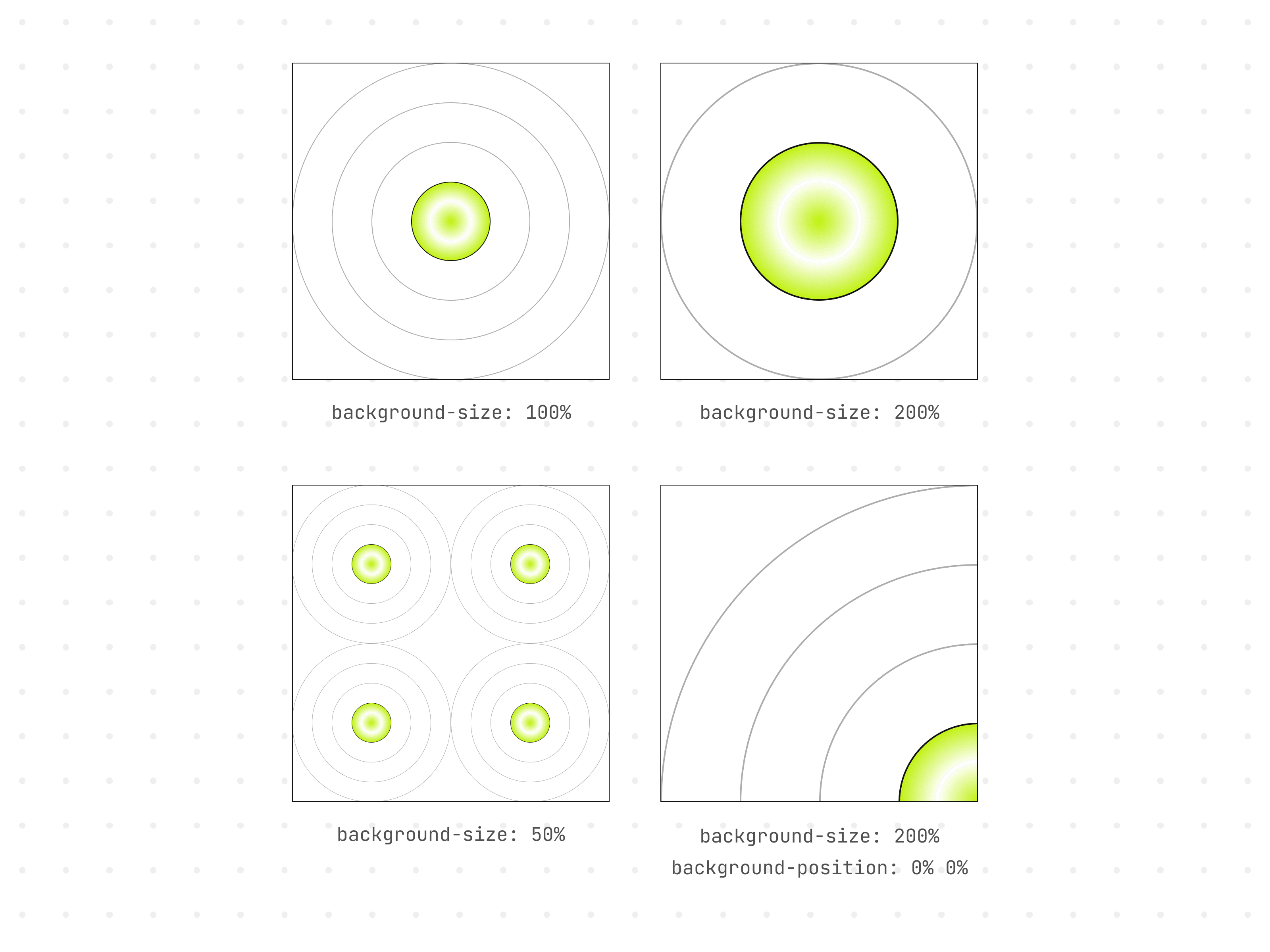
While the repeating-radial-gradient() function includes syntax for determining the radial pattern's size and position, I find it more convenient to control the size and position separately using background-size and background-position.
By adjusting the size and position, unique effects can be created.
04 / 05
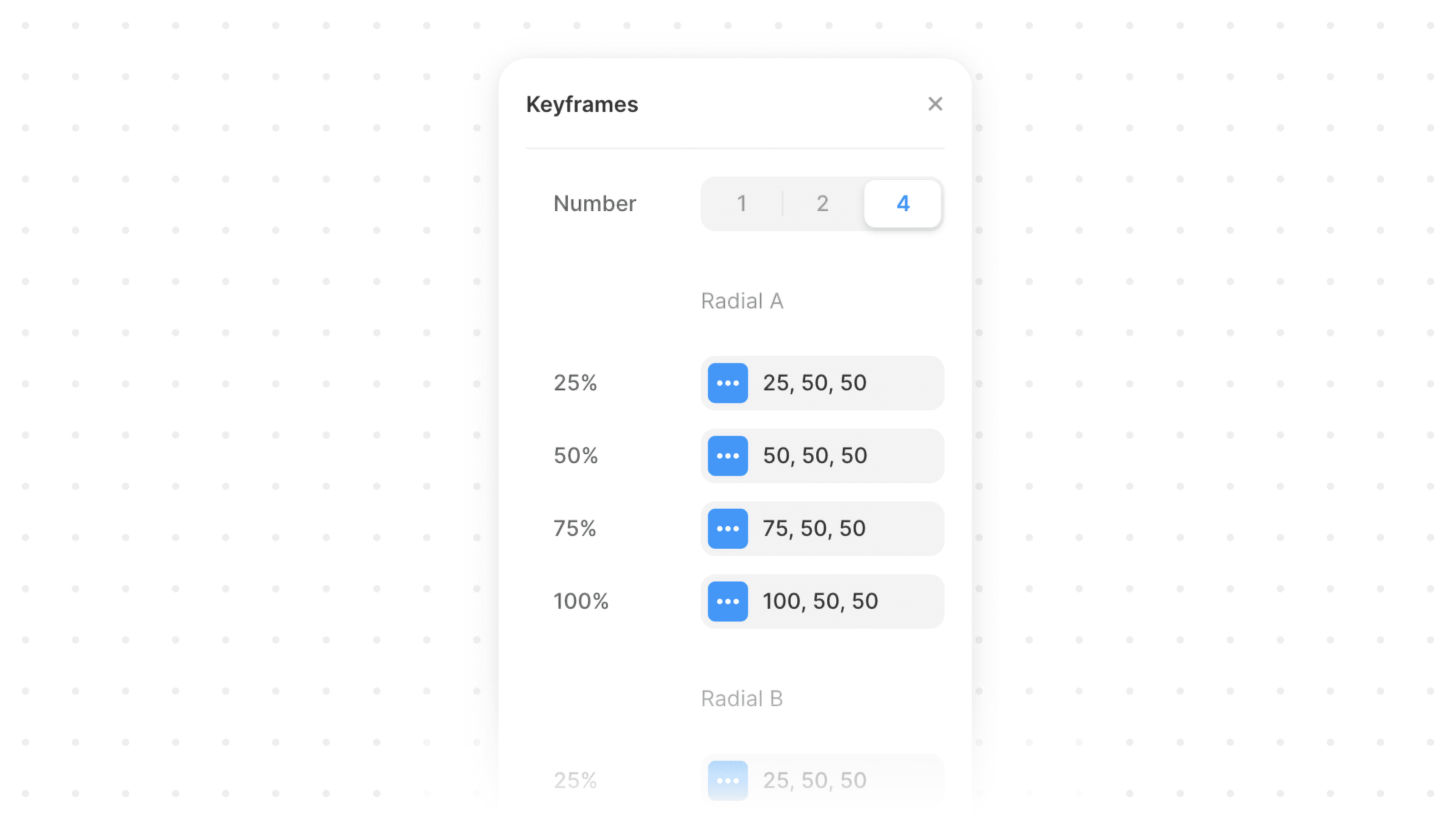
Keyframe animations
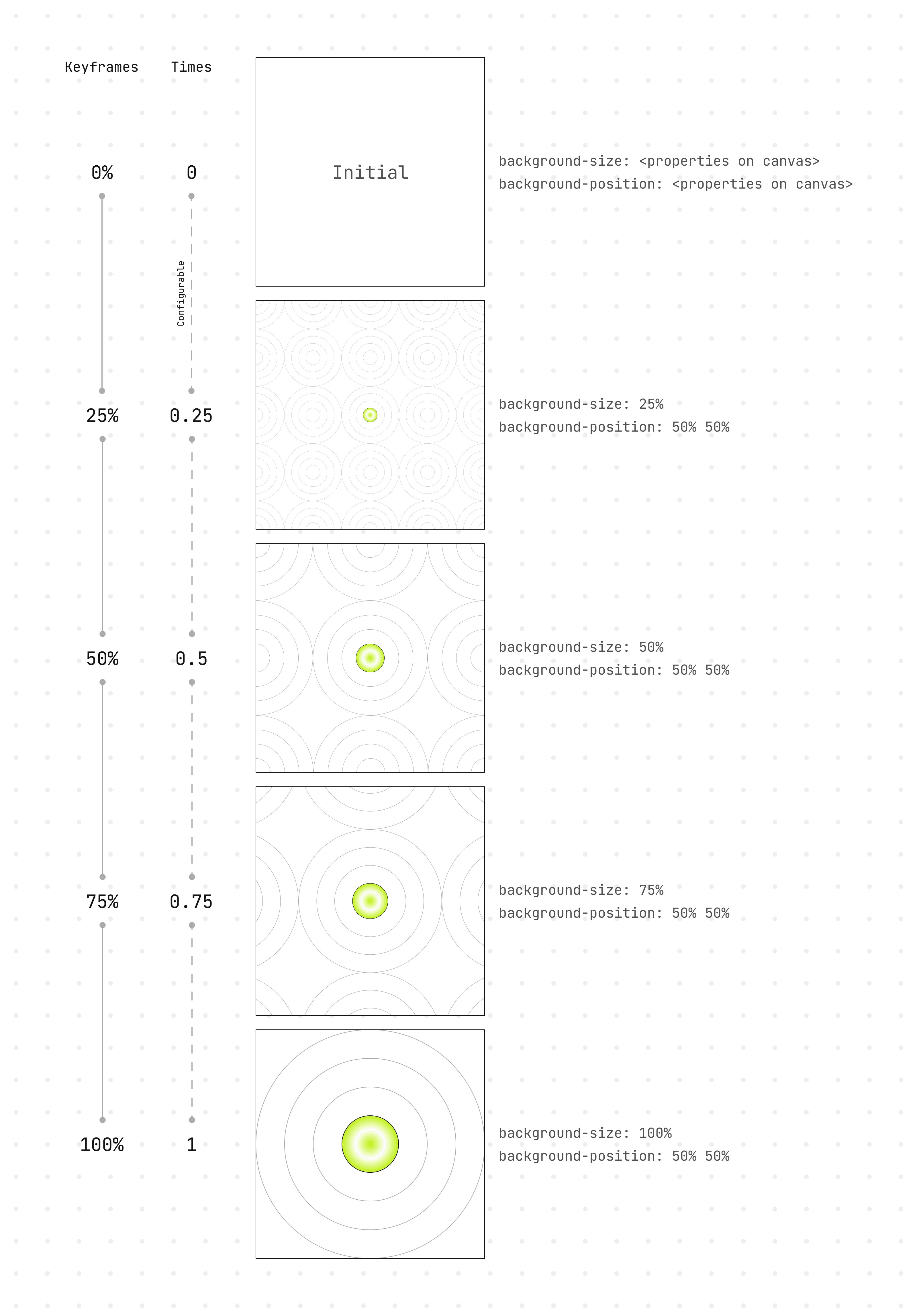
Animations bring the pattern to life. This Framer component employs a duration-based animation type: "tween" and offers the flexibility to specify various keyframes for the animation:
0 → 100%
0 → 50% → 100%
0 → 25% → 50% → 75% → 100%
Each keyframe allows customization of background-size and background-position, enabling the choreography of the pattern's movement within the container.
By default, each keyframe occupies an equal portion of the overall duration. However, using a times array, users can designate when each keyframe in the sequence should be reached. Values between 0 and 1 represent progress values in the sequence. The times values will always start at 0 and end at 1, and the number of values in times should match the number of keyframes.
The keyframe at 0% reflects what users see on the design canvas and is set as the value for the initial prop within the motion component.
The function below generates the appropriate background properties for background-size and background-position based on the number of selected keyframes through the Framer UI. These values populate the variants.
Using if…else conditions, the correct properties are generated depending on the number of chosen keyframes.
05 / 05
Final thoughts
To wrap up, this component is available for free (Or pay what you want) where I'll be actively maintaining and updating it. Feel free to visit the demo at radial-background.framer.website to explore the various effects that can be achieved with this component.
If you think it might be a valuable addition to your project, go get it!